To navigate org charts in Agentnoon, you really only need to know a couple of key features, but they can help you visualize your data powerfully.
The first thing is navigating the org chart. When you click at any point, you can drag like this to move the org chart around. You can pinch using your fingers just like an iPhone to zoom in and out. You can also zoom in and out using the buttons at the bottom right. There's a fit-to-screen button that will right-size the org chart based on your screen size and make sure everything fits nicely.
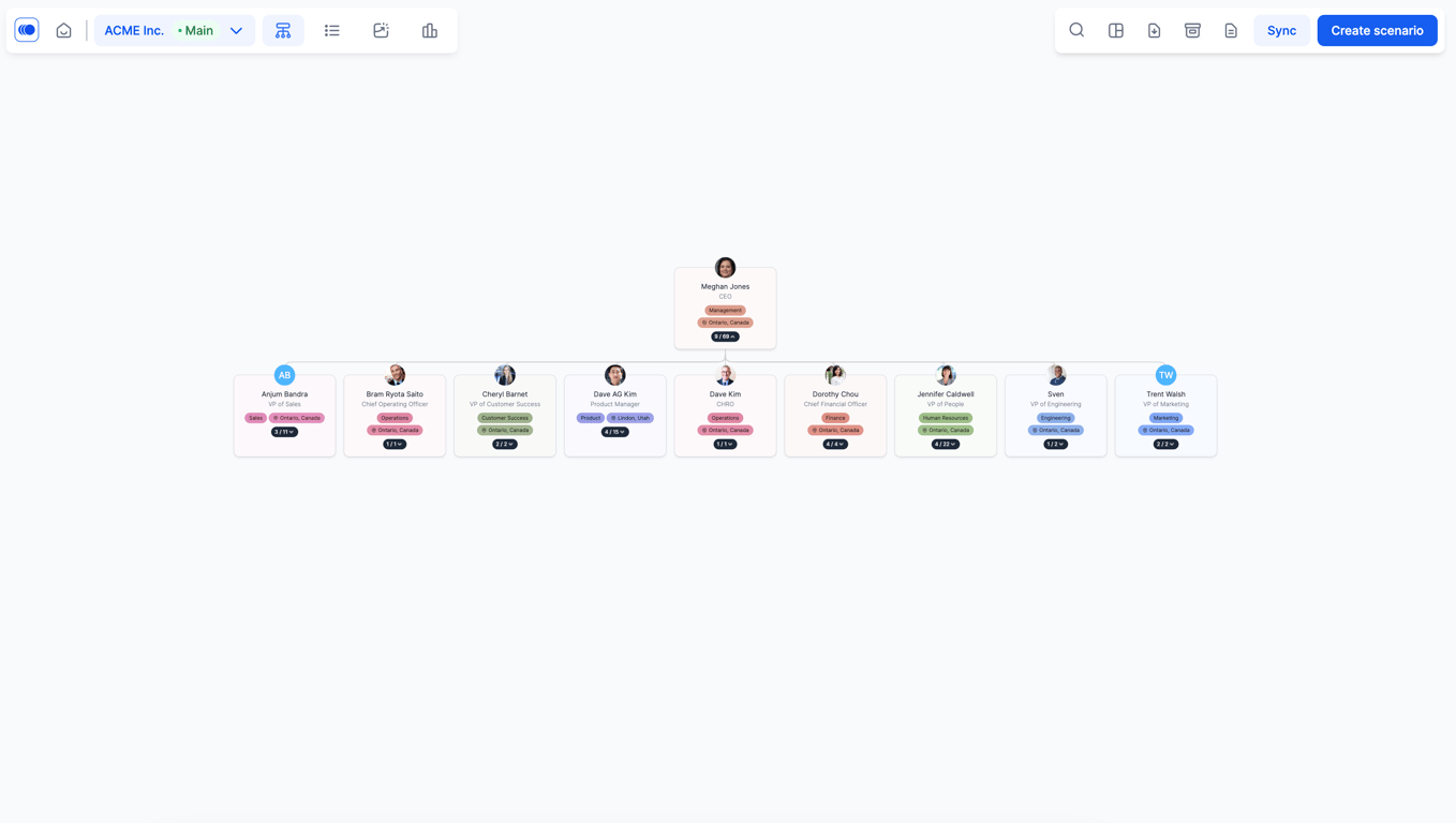
The expand or collapse all button just really opens up or expands the whole org chart.
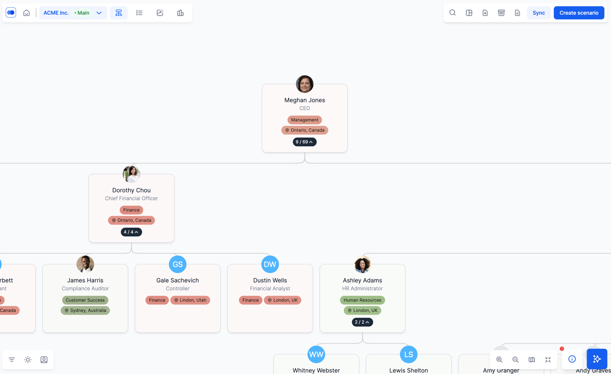
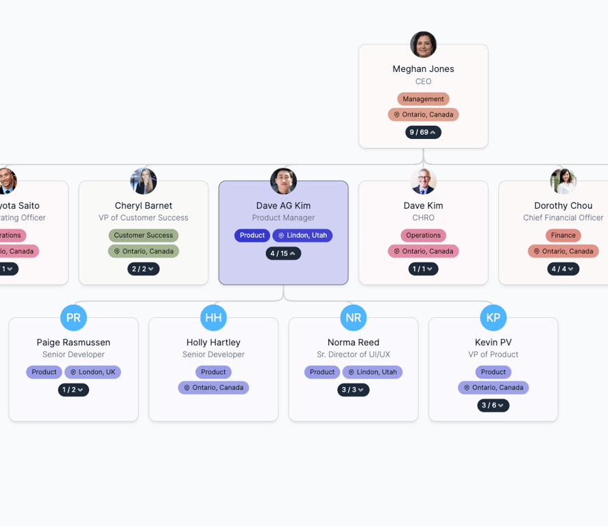
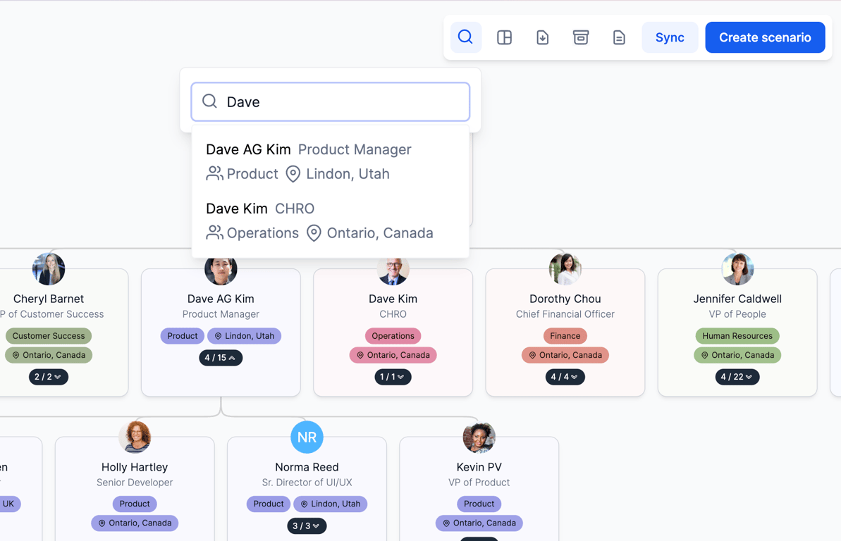
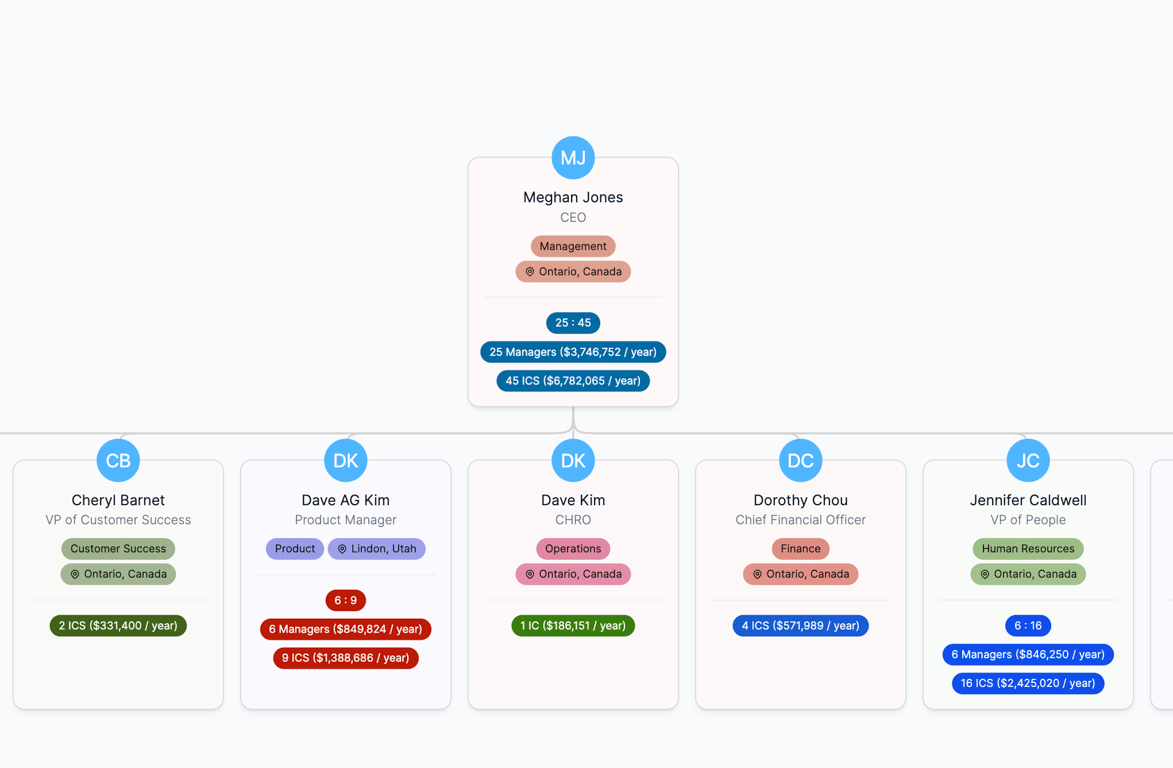
Within the org chart, you can press this black button here with the arrow key. That's how you open in and out of different teams. So, for example, if you want to open Dave's team here, you'll click here and you'll see the team under him opens up. These numbers, where it says 4 and 15, identify the number of direct and indirect reports. So, Dave has four direct reports and he has a total of 15 employees under him.
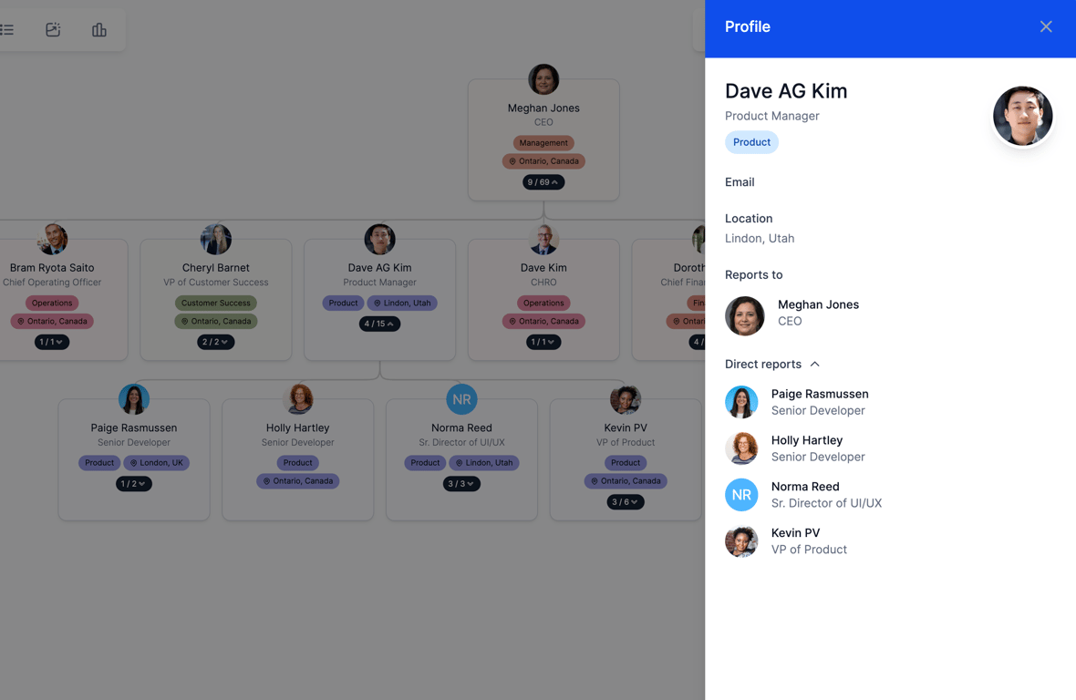
When you click on any card, you'll see a sidebar typically open up with information about this person. So, it has some standard stuff like, you know, who they report to, their direct reports, etc so useful if you want to go and take any kind of detail on anyone.
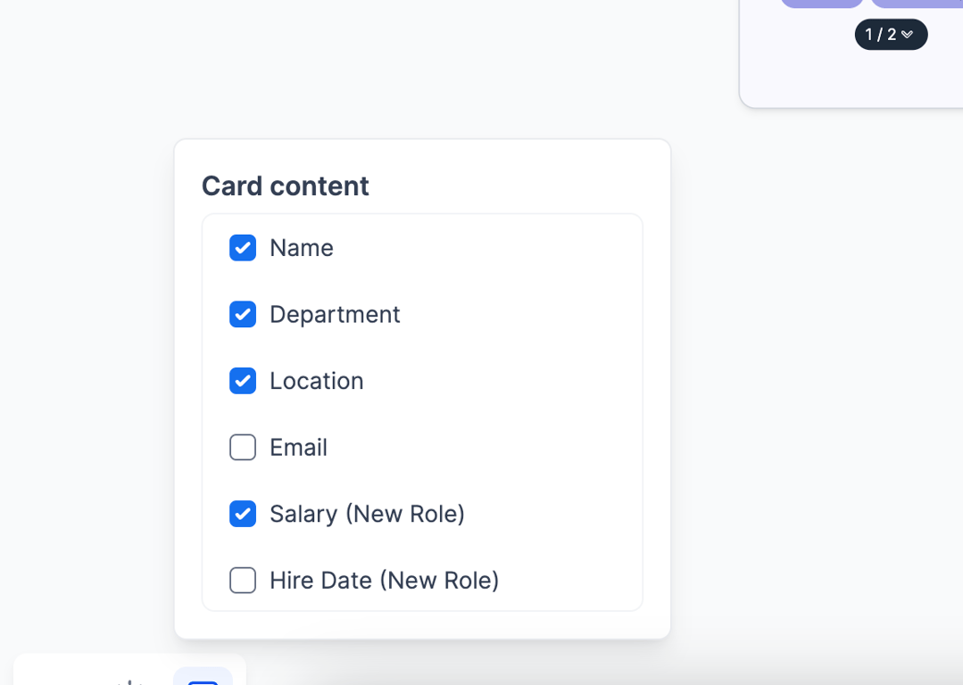
I'll click on Dave here on his name and the sidebar opens up. The colors and information on the org chart are from the bottom left. The first button is card content, which lets you toggle on different fields. So, if you have a performance field, you can toggle on everyone's performance rating. If you have entities, you can toggle them on.
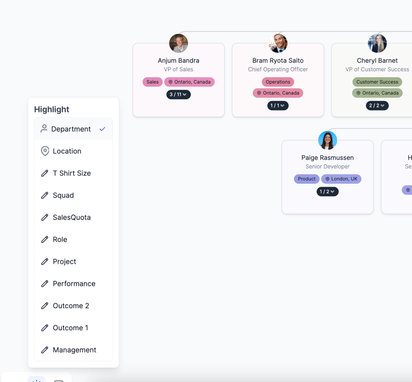
In the highlight feature, every department is a different color. But if you want to highlight, let's say by location, you can have all Canadian employees in one color, all US in another color, as an example.
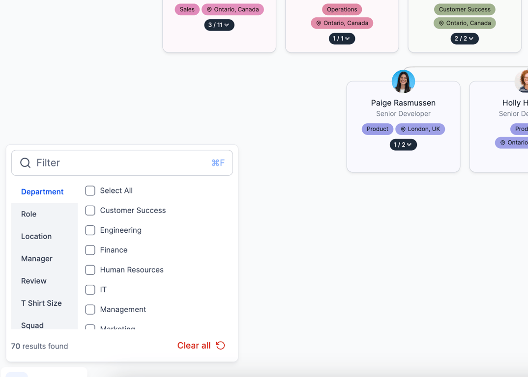
Filtering is just a way to navigate large sets of org data. So, if I only want to see, let's say finance, HR, engineering, and customer success, I can filter the org chart that way. And then I can do a multi-select.
This view of the org chart is not the only one that we have. On the top right, you'll see a few more buttons. The first one is really just the search within the organization.
Views are different ways of visualizing the org chart so you could do it by positions or roles, which is essentially showing how many of each kind of role I have versus every individual person. If you jump into a specific team, you can very quickly see what the role hierarchy is, and how many of each kind of person you have.
Positions and dotted lines are to see the primary and secondary manager relationships.
Executive board is really just for the C-suite summary, where you can see the number of ICs and managers a specific C-suite member has, and what the costs are. Similar to executive board, manager view is essentially an extension of that, where now it displays that data for everyone within the company that has some kind of reporting structure under them.
The other views you can explore in your own time, we have what we call an overview view, which is if you have thousands and thousands of employees, you might want to slowly open up the org chart without overwhelming whoever's navigating it, so you can open the org chart by different teams and see a nice little summary of, again, what kind of people they have and how many they have of that.
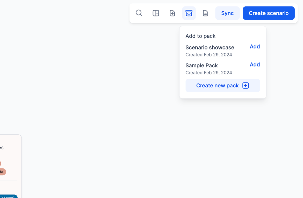
The last couple of buttons here are exporting to PowerPoint, so to do that, you can essentially kick this PowerPoint button and then add or remove items to a slide pack, and similarly if you want to save as an image, you can click the export the image button and save a low-res or high-res image.
Lastly, when you're done with the org chart and you want to make changes, you can click on create scenario in the top right to create future possible versions of this org structure.