- Agentnoon Help Center
- Organizational Design / Hub
- Proportion Chart
Configuring proportion charts
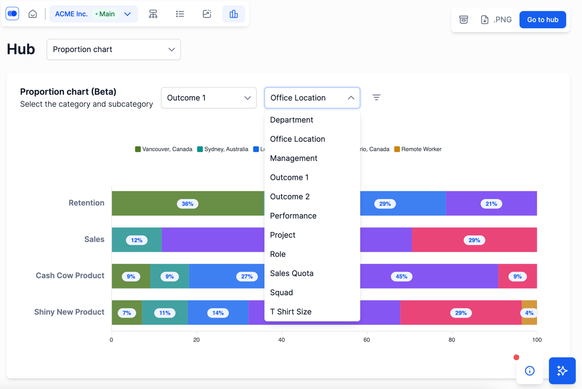
Proportion charts are a great way to visualize the composition of various business pillars. Set any two categories, depending on your data.
-
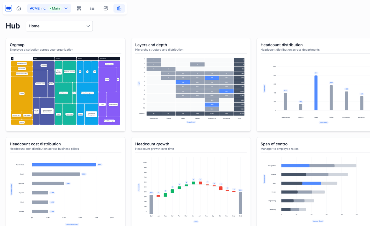
To navigate to the proportion chart graph, select “Hub” on the uppermost panel and scroll to the bottom to select “Proportion Chart”.
-
You can set a primary category and subcategory — the selections for each may vary based on what data you’ve connected.
-
Once you select categories, you can see the composition of different business pillars. You can also change the subcategories to see different views.